
An Evaluation of Semantically Grouped Word Cloud Designs
By Marti Hearst, Emily Pedersen, Lekha Patil, Elsie Lee, Paul Laskowski, & Steven Franconeri
TL;DR
We conducted a series of controlled experiments that show that layouts in which words are arranged into semantically and visually distinct zones are much more effective for understanding the underlying topics than standard word cloud layouts. White space separators and/or spatially grouped color coding led to significantly stronger understanding of the underlying topics compared to a standard word cloud layout, while simultaneously scoring higher on measures of aesthetic appeal. An additional contribution of this work is the development of a dataset for a semantic category identification task that can be used for replication of these results or future evaluations of word cloud designs.
Background
We started this research during my junior year of undergrad and continued through my Master’s year. I worked with Professor Marti Hearst (my Master’s advisor), Professor Paul Laskowski from the UC Berkeley School of Information, a fellow Berkeley student, and collaborators from Northwestern University. Our paper was accepted to VIS ‘19 and published in the IEEE Transactions on Visualization and Computer Graphics Journal.
Supplementary materials: Professor Hearst wrote a blog post about our research for Visualization Research Explained’s Medium publication, and implemented a WordZones visualization. Also please feel free to take a look at the dataset we created for our semantic category identification task.
Problem Statement
Before we begin, let me explain what word clouds are. Word clouds are a collection of words depicted in different sizes. The size or boldness of a word reflects how often that word appears in a body of text. Word clouds are often eye-catching, engaging, and easy to make using online tools. Now, let’s get into the problem with word clouds.
Below are two word clouds (Figure 1 and Figure 2) summarizing Obama’s final State of the Union address. What do these word clouds tell us about his State of the Union address? Take about 30 seconds or so and write down what you think were the major themes from his speech. Go ahead, I’ll wait :)

Figure 1. Word cloud summarizing President Obama’s final State of the Union address by USA Today
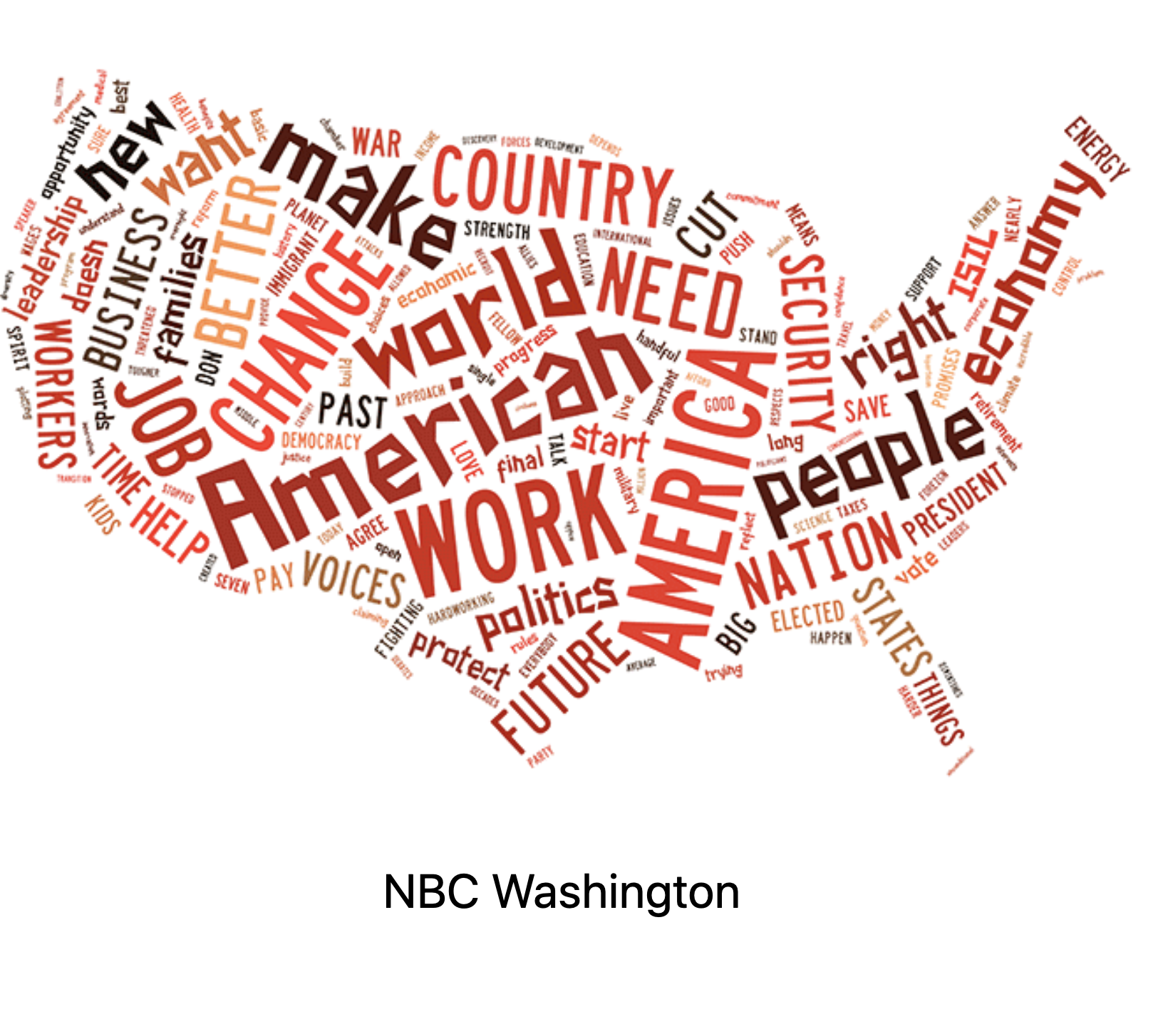
Figure 2. Word cloud summarizing President Obama’s final State of the Union address by NBC Washington
Some common answers are that the speech is about America, the economy, work, and change. Now, let’s read a summary of Obama’s final State of Union address by USA Today and see how accurate those answers are:
“Obama defended the progress made over the last seven years and set out an agenda that will likely remain unfinished long after his presidency ends: turning back the effects of climate change, launching a ‘moonshot’ to cure cancer, and a grassroots movement to demand changes in the political system.”
These word clouds fail to bring attention to the major themes of his speech, which were turning back the effects of climate change, curing cancer, and demanding change in the political system. From this example we can see that for summarizing text, word clouds are inaccurate, hard to use, and sometimes downright incoherent!
Research Question
So, what design would be better? We set out to see if we could build a better word cloud, retaining their visual appeal, yet making them more comprehensible. First off, the words drawn from the document must be grouped into a few meaningful categories that make sense to the reader. Secondly, we need to visually subdivide categories. There are several ways we can visually suggest closeness in a word cloud, which are:
Place words from the same semantic category in a group near one another.
Separate groups of words from one another with open space.
Assign the same color to words in the same semantic category.

Figure 3. WordZone of President Obama’s final State of the Union address
These strategies make use of basic principles of perceptual psychology. We called this approach for designing word clouds, WordZones.
Compare this WordZones design (Figure 3) our team manually made to the first two word clouds and see if you think it’s easier to interpret. In this WordZones design we can see several distinct themes, such as climate change, medical research, Iran, economy, military, & leadership that were undiscoverable in first two word clouds. This WordZone design is just one layout option; many others are possible.
Research Methodology
Timeline
We worked on this project for about two and a half years, with the last year wrapping up much of the work.
Brainstorming solutions to problematic word clouds: 4 months
Literature review: 3 months
Iterate on design solutions: 3 months
Pilot usability study on designs: 1 month
Create dataset for semantic category identification task: 2 months
Design formal experiment: 1 month
Create/send out Qualtrics survey: 2 months
Analysis: 2 months
Write final paper: 3 months
RecruiTment Criteria and Process
Our participants were Mechanical Turk crowd workers. All participants were requested to be fluent English speakers. For Experiment 2 and 3 (described below), participants had to pass a color vision check. Participants were paid $9 per hour, and were not allowed to repeat any task.
Study Design
Word clouds are described in the literature as being useful for analytic tasks, including finding the gist of underlying document or summarizing a body of text. We wanted to create a highly reproducible task that reflects the goal of using word clouds for analytic tasks, so we devised a task similar to a game of Taboo. Taboo is a word, guessing party game in which a player has their partner guess the word on the their card without using the word itself or the five additional words listed on the card.
Before our formal study, we conducted a pilot in-person usability study of various word cloud designs to validate our instrument and form hypotheses. We conducted 4 formal experiments, with all 4 conducted through Qualtrics. For the first 3 experiments, participants were shown 12 designs, each with 25 words and 5 categories to be guessed, and had 15 seconds to view each visualization and write down the categories. The goal of 4th experiment was to understand subjective preferences of various word cloud designs. Here are brief descriptions and results of each experiment:
Experiment 1: We examined the role of white space and font variation in word cloud layouts, finding strong evidence that word clouds as designed in Wordles (typical word clouds) are difficult for extracting semantic theme information, especially as compared to a simple design that can achieve the same goal.
Experiment 2: We added color to the designs, showing that semantically-coded color can improve performance.
Experiment 3: We relaxed the white space requirement, finding that color coding and spatial proximity can perform nearly as well as coding with white space gaps.
Experiment 4: We obtained subjective responses for 4 different designs, finding that participants preferred word clouds with a more organized layout over more typical word cloud designs.
Below are two examples of designs we presented in our second experiment, in which we tested the affects of adding color. In Figure 4 (a WordZone design our team created), all the cue words for a given category were assigned the same color and visually grouped together. In Figure 5, widely known as a Wordle, color is assigned to each semantic category but the words of each category are not grouped together. Participants performed better on the task when viewing the WordZone Color Column design, and preferred that layout more compared to the Color Wordle design.

Figure 4. Color Column WordZone design

Figure 5. Color Wordle design

Figure 6. 4 word cloud designs, each advertising for a biology course.
In the fourth experiment, we asked participants to compare 4 designs and tell us their preferences along these criteria: readability, informativeness, visual appeal, and engagement. They were told to assume the word clouds were on a flyer advertising a biology class. Figure 6 are the 4 designs we showed to our participants. The column WordZone design (top left) and radial view (bottom left) were similar to each other across criteria, which suggests people might prefer them equally for many situations. The BSC layout (top right, named after the author, Barth, and his algorithm, the seam carving algorithm) fell in between, which surprised us since we thought people might prefer the spatial group of a typical word cloud given no time pressure. The Davies Layout (bottom right, named after author of code to generate this layout) received low scores across dimensions except for engagement, for which it rated similar to the other designs.
Findings
Our key findings are:
Visually grouped layouts are more effective in time-constrained category understanding tasks, compared to ungrouped layouts.
Visual grouping can be done by separating categories via white space or by color distinction, or both together.
Layouts defined by white space tend to be preferred over more tightly packed, less organized looking layouts for analytics tasks.
Impact
We can improve text summarization beyond the standard word cloud by organizing words into coherent, spatially proximal groups. So next time you need to visualize a document, I hope you will reconsider using a word cloud. Instead organize text into zones of meaning via spatial or color grouping, so everyone can get the gist, while they have something aesthetic to look at!